Displaying scalar values in text form is certainly useful, but nothing is better than a graph to give you a handle on what is happening with your system. DAQFactory offers many advanced graphing capabilities to help you better understand your system. In this section we will make a simple Y vs time or trend graph.
1) If you are still displaying the page with the value on it, hit the 1 key to switch to Page_1. If you are in a different view, click on Page_1 in the workspace.
The workspace is only one way to switch among pages. Another is using speed keys which can be assigned to a page by right clicking on the page name in the workspace and selecting Page Properties....
2) Right click somewhere on the blank page and select Graphs - 2D Graph. Move and resize the graph so it takes up most of the screen by holding down the Ctrl key and dragging the component. Drag the small black square boxes at the corners of the selected graph to resize. Next, open the properties window for the graph by right clicking on the graph and selecting Properties....
3) Next to Y Expression: type Pressure.
The Y expression is an expression just like the others we have seen so far. The difference is that a graph expects a list (or array) of values to plot, where in the previous components we have only wanted the most recent value. By simply naming the channel in the Y expression and not putting a [0] after it, we are telling the graph we want the entire history of values stored in memory for the channel. The history length, which determines how many values are kept in memory and therefore how far back in time we can plot is one of the parameters of each channel that we left in its default setting of 3600.
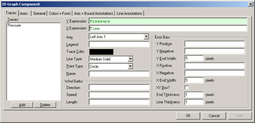
4) Leave all the rest in their default settings and click OK.
You should now see the graph moving. The data will move from right to left as more data is acquired for the pressure channel. However, we currently are multiplying our Pressure channel reading by 100 using the Conversion we created a few sections ago, so the trace is completely off scale and not visible. To display the data, we need to change the Y axis scaling.
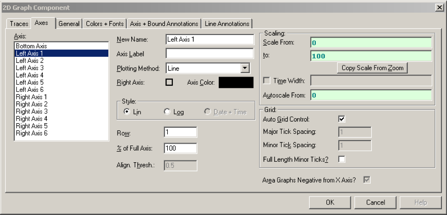
5) Double click on the left axis of the graph.
Unlike other components, you can double click on different areas of the graph to open the properties window for the graph to different pages. Double clicking on the left axis brings up the axis page with the left axis selected. You can also just open the properties window for the graph and select the Axes tab, then Left Axis 1.
6) Next to Scale From enter 0, next to Scale To enter 100, then click OK.
This will scale the graph from 0 to 100. Depending on what you have plugged into your LabJack input, or what voltage the LabJack is floating at, this may or may not be a big enough scale. You can always click on Page_0 in the workspace to see what the current Pressure reading is and change the scaling of the graph appropriately.
Now we'll try another method to scale the graph.
7) Open the graph properties box again and go to the Traces page. Change the Y Expression to Pressure / 100 and hit OK.
Like the other screen components, the expressions in graphs can be calculations as well as simple channels. In this case, we are dividing each of the values of Pressure's history by 100 and plotting them. This is essentially removing the conversion we applied to Pressure in the previous section since it multiplied our reading by 100.
8) Deselect the graph by clicking on the page outside of the graph. The shaded rectangle around the graph should disappear. Next, right click on the graph and select AutoScale - Y Axis.
The graph component has two different right click pop up menus. When selected, the graph displays the same pop up menu as the rest of the components. When it is unselected, it displays a completely different pop up for manipulating the special features of the graph.
After autoscaling, you should see the graph properly scaled to display your signal zoomed in. Notice the rectangle around the graph. The left and right sides are green, while the top and bottom are purple. The purple lines indicate that the Y axis of the graph is "frozen". A frozen axis ignores the scaling parameters set in the properties window (like we did in step 6 above) and uses the scaling from an autoscale, pan, or zoom.
9) To "thaw" the frozen axis, right click on the graph and select Freeze/Thaw - Thaw Y Axis
Once thawed, the graph will revert to the 0 to 100 scaling indicated in the properties box and the box surrounding the graph will be drawn entirely in green. At this point you may wish to change the scaling to 0 to 5 using steps 5 and 6 above since we have divided Pressure by 100.
10) Double click on the bottom axis to open the properties to the axis page with the bottom axis selected. Next to Time Width:, enter 120 and click OK
If the double click method does not work, you can always open the properties window for the graph using normal methods, select the Axes page and click on Bottom Axis.
In a vs. time graph, the bottom axis does not have a fixed scale. It changes as new data comes in so that the new data always appears at the very right of the graph. The time width parameter determines how far back in time from the most recent data point is displayed. By changing it from the default 60 to 120 we have told the graph to plot the last 2 minutes of data.
Once again, if you zoom, autoscale, or pan the graph along the x axis, it will freeze the x axis and the graph will no longer update with newly acquired values. You must then thaw the axis to have the graph display the trace as normal.
Sample file: LJGuideSamples\Graphing.ctl